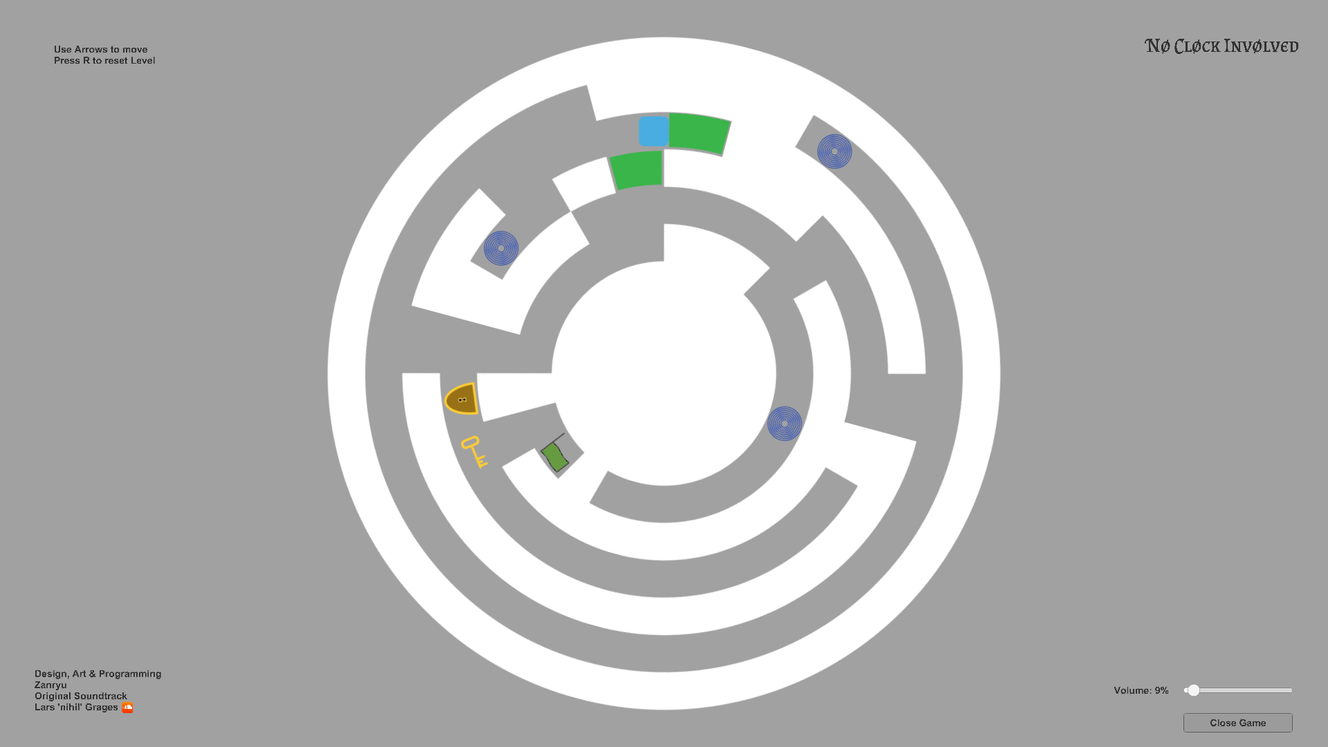
I think it'd work better if movement was put on a "polar grid", as I've had several cases where something would just not fit, or I just overshot it, and had to go all the way around to fix that or reset the level.
It's a fun puzzle game, original as far as I can tell - never played anything quite like it. It shakes a bit back and forth when pushing blocks or keys (or bumping into walls) and that gets a bit annoying. Turning is fluid but moving up and down is quantized and you can occasionally push a key or black in such a way that the puzzle can't be solved - but there's a rest button so it's not a big problem. Graphics could be more diverse and interesting, but that's not the most important thing in these kind of games.
This one got me thinking! and got me a little dizzy :P I would love to see more levels and maybe some textures for the puzzle. Thanks for making this game!
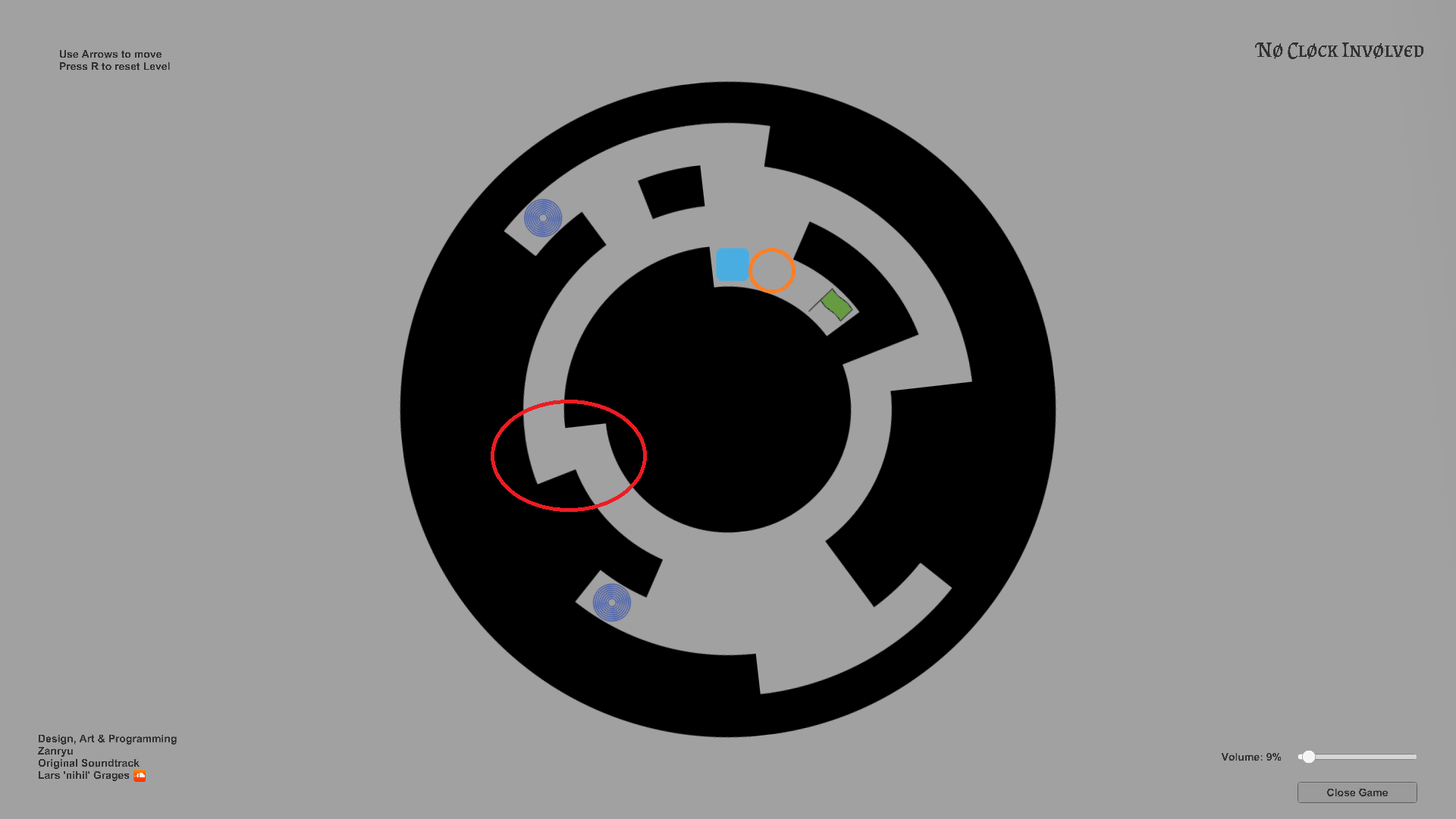
Very cool idea! I really like the design. it's kinda annoying tho that puzzle usually took place in 1/3 of the circle and you had to go around over and over again to move key a little bit every time. This level also annoyed me, the gap (red cicle) is a bit too small, your character can't pass it unless you hold both right and up at the same time. also, when key was in orange circle position, it took me 3 tries to squeeze between in and a wall, scoring me 3 unnecessary laps and 3 unnecessary passes through that a bit broken gap.
i also got stuck there, overall it's quite easy to get stuck
other than that, as I said, I really love this game and I'm looking forward to your future projects
Thanks for your input. Funnily enough some friends of mine also noted these issues and I only fixed them for the Linux version as I clearly had only minor problems with them, but you are right. Even with minor problems I already should have addressed them.
This is why I re-uploaded the Windows version with the fixed problems. Thanks for that additional input.
One reason I decided to let the player do a full circle is, partially, to fit more with the theme "Cycles". ^^ But another reason is to ensure, even after the first level, that the player knows that he only can walk in one direction.
Secondly, the player has to be aware of his actions, even if can approach them again from the same angle. Next, perspective can change as the view changes. Especially in later levels where more space is used for problem solving.
Lastly, I thought it would be good to have a "speed" button, but ultimately decided against it as it would undermine the theme of time being a constant (under equal circumstances).
Thanks for the reply and insight I also think it fits the theme better this way. I just pointed out that speed still was a minor annoyance that added up to the fact that due to some gaps feeling too narrow you had to go around multiple times until you fit the near pixel perfect position
← Return to game
Comments
Log in with itch.io to leave a comment.
I think it'd work better if movement was put on a "polar grid", as I've had several cases where something would just not fit, or I just overshot it, and had to go all the way around to fix that or reset the level.
It's a fun puzzle game, original as far as I can tell - never played anything quite like it. It shakes a bit back and forth when pushing blocks or keys (or bumping into walls) and that gets a bit annoying. Turning is fluid but moving up and down is quantized and you can occasionally push a key or black in such a way that the puzzle can't be solved - but there's a rest button so it's not a big problem. Graphics could be more diverse and interesting, but that's not the most important thing in these kind of games.
Short gamepaly video - S P O I L E R S -
This one got me thinking! and got me a little dizzy :P I would love to see more levels and maybe some textures for the puzzle. Thanks for making this game!
Very cool idea! I really like the design. it's kinda annoying tho that puzzle usually took place in 1/3 of the circle and you had to go around over and over again to move key a little bit every time. This level also annoyed me, the gap (red cicle) is a bit too small, your character can't pass it unless you hold both right and up at the same time. also, when key was in orange circle position, it took me 3 tries to squeeze between in and a wall, scoring me 3 unnecessary laps and 3 unnecessary passes through that a bit broken gap.


i also got stuck there, overall it's quite easy to get stuck
other than that, as I said, I really love this game and I'm looking forward to your future projects
Thanks for your input. Funnily enough some friends of mine also noted these issues and I only fixed them for the Linux version as I clearly had only minor problems with them, but you are right. Even with minor problems I already should have addressed them.
This is why I re-uploaded the Windows version with the fixed problems. Thanks for that additional input.
One reason I decided to let the player do a full circle is, partially, to fit more with the theme "Cycles". ^^ But another reason is to ensure, even after the first level, that the player knows that he only can walk in one direction.
Secondly, the player has to be aware of his actions, even if can approach them again from the same angle. Next, perspective can change as the view changes. Especially in later levels where more space is used for problem solving.
Lastly, I thought it would be good to have a "speed" button, but ultimately decided against it as it would undermine the theme of time being a constant (under equal circumstances).
Thanks for the reply and insight
I also think it fits the theme better this way. I just pointed out that speed still was a minor annoyance that added up to the fact that due to some gaps feeling too narrow you had to go around multiple times until you fit the near pixel perfect position
other than that, it's a great idea for a game